anchorSide by side

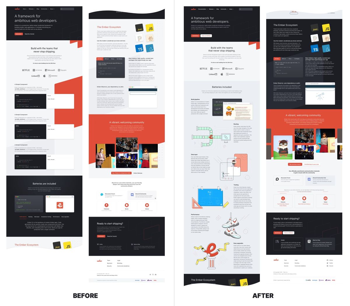
You can also download a full sized comparision, side by side. Be warned, it is huge.
anchorLarge changes
After a discussion with the Ember Learning Core team, the "Try out" section was removed. There wasn't enough time left to create the section in a meaningful way and it didn't communicate the real strengths of Ember.js.
We unfolded the tabs in the Batteries included section, so the core benefits of Ember are visible right away. This gave us a chance to add playful illustrations and lighten up the otherwise quite technical content.
anchorLittle changes, big effort
anchorA new font for Ember.js
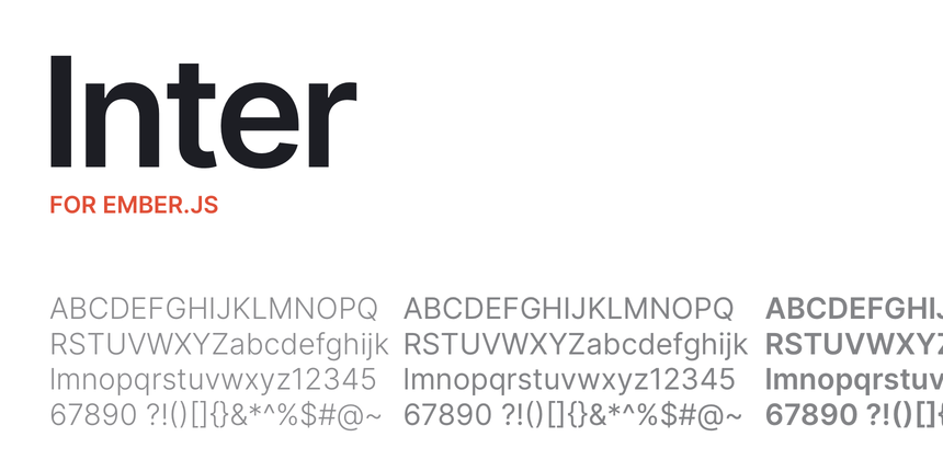
The font choice for the original RFC was lovely, and we are big fans of the Metric fonts by Klimt, but it was necessary to find a solution that is open source and does not involve licensing costs. After testing eight or more other alternatives, we settled on an excellent open source font:

Meet Inter, the new font representing Ember.js typographically in written word. It is not only well suited and tailor-made for user interfaces in general, but provides an exceptional range of cuts for all applications. It is both friendly and has an earnest quality that balances well against the playfulness of the Ember.js logo and mascots.
anchorTypography
The new website now has a typographic scale which provides not only a range of font sizes and appropriate line spacings, but also includes harmonic offsets that can be applied across the design, making it easy to add white space and layout organization to any element on a page.
anchorHalf a gradient of colors

The RFC mockup introduces a new slate color to mark a new era for Ember. The Ember red represents the community. The new slate stands for the professionalism and strong foundation in quality. In short, they are meant to symbolize that Ember's strength lies in its an amazing community and reliability for businesses.
As you might have noticed, we are still lacking secondary colors, which are not settled yet and will become part of the second pass of changes to the Ember.js website ecosystem.
anchorStyle guide
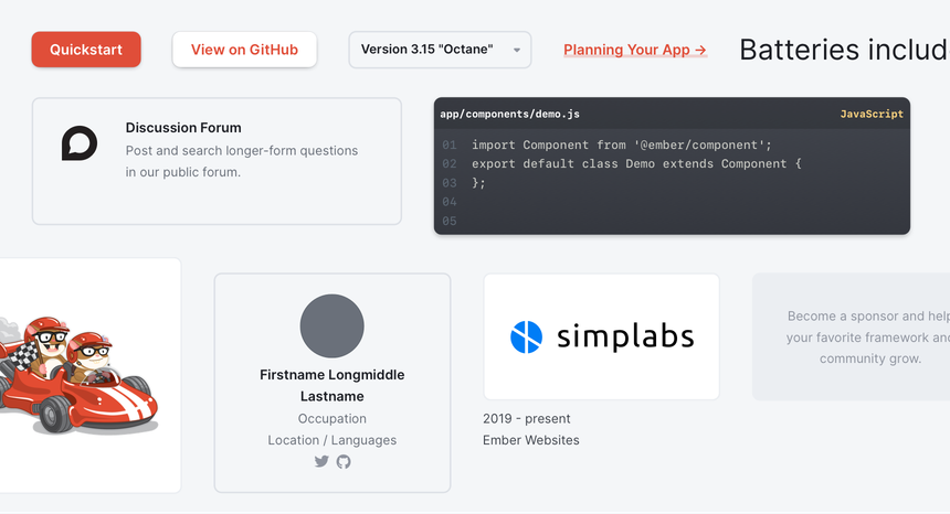
Having a mockup is nice, but it doesn't solve the complex task of building a theater of pages and small web apps which in total represents the online presence of Ember. We now have a living breathing style guide, which is both an ember-cli addon that can be consumed by the website and all the adjacent projects, but also live documentation that can be viewed online and, no surprise, is an Ember application itself, thanks to the magic of empress and ember-styleguide.
The style guide provides both actual Ember components that can be applied to any Ember project and a full set of CSS custom properties and helpers which make it easy to create good looking pages from scratch.

Beyond the purely visual aspects of the design, I also introduced some lightweight CSS helpers for things like spacing, font sizes, grid and layout. Some of them were inspired by Tailwind, while others are explicitly narrow in their options to ensure overall consistency and to make them easier for contributors of the website to work with. Take a look at the styleguide preview to learn more about this.
anchorThanks
Allocated time donated by Mainmatter allowed me and others to bring the styleguide and overall design of the website to what you can see online now. I was very honored by being invited to this project and my design changes were just an ever so small piece of the huge effort that went into the website from every single human on this team.
I'm glad we made it, and I'm looking forward to contributing more and updating all the other aspecs of the Ember.js website landscape soon.
