anchorInterface inventories 101
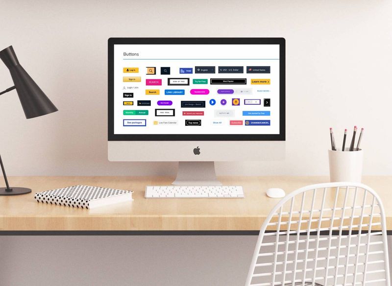
An interface inventory is a categorized collection of every piece of design that makes up our digital product. They help us capture the status quo of every style (e.g. colors, typography, spacing, borders) and components of a user interface.
There are many benefits for creating one:
- They help us gain clarity regarding which design components make up a digital product.
- Help us discover and analyze unintentional inconsistencies between them.
- Is a conversation starter for our team on how to refactor design with a pattern-based approach.
- It serves as a blueprint for a pattern library.
- And last but not least, it is an aid to communicate and gain buy-in from stakeholders to establish a design system.

anchorWhen should you start?
An interface inventory can be done at any phase of the product development process. Some teams start when kicking off a redesign or if they are struggling with confusion due to inconsistencies. However, there also may be no perfect time to start. If you and your team don't have a clear overview of your digital design, use that as a sign to get started with an interface inventory.
anchorPlanning the project
When planning an interface inventory, we can lean on Nielsen Norman Group's guidelines for content inventory and auditing. These ensure we are thinking of people, process, and tools:
anchor1. People
- Establish ownership: Ensure there is a person responsible for both the process of creating an inventory and the artifacts that are created as a result.
- Involve others early on: Inform stakeholders, designers, developers, and product managers–anyone working on building the digital product. Agree on the inventory criteria (e.g. color, spacing, typography, borders, sizes).
- Provide meaningful updates: Others are more likely to trust and care about what you do with the interface if you keep them meaningfully informed. Don't overwhelm with detail, and end with a funny gif (always end with a gif!).
anchor2. Process
- Develop a "baby steps" mindset: Break up the effort in small increments. Start with a manageable yet impactful subset.
- Prioritize core features, the happy path (the optimal user journey), or the top-level navigation.
- Divide and conquer with collaborators. Give a concrete example of the process of capturing design for the inventory.
anchor3. Tools
- Choose a tool that has a low learning curve. Use something that is already in your toolset and is familiar to collaborators.
- Explore automation tools to gather data. However, ensure people handle the audit portion.
- Time-box it (e.g. an initial period of 6 weeks). Make some meaningful progress and gain momentum.
anchorStep-by-step process
anchorStep 1: Identify the scope
Start off by identifying which part of your digital product you will be creating an inventory of first. You can decide on starting an inventory of the happy path, your core features, or your website's top-level navigation.
anchorStep 2: Identify which characteristics you want to inventory
An interface inventory includes specific characteristics which are captured at several layers. For example, a component (a button) can be captured as such, as well as through the foundational styles that create it (colors, typography, icons, spacing).
Use the following as a guideline:
anchor1. Foundations
Foundations are the basic building blocks of your UI:
- Colors
- Typography
- Icons
- Spacing
- Grids
- Motion
anchor2. Components
Components are reusable UI elements made with foundations:
- Buttons
- Cards
- Input fields
- Navigation
- Pagination
- Tabs
- Tables
anchorStep 3: Observe the existing CSS
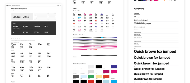
When making an inventory of the foundations, CSS stats can be a good place to start. CSS Stats is a free and open-source tool to help visualize stylesheets. You can gain insights on existing layout and structure (display, float, width, height), spacing (padding & margin), skins (color, background color, border color, box-shadow), typography (font family, size, weight, alignment, line height, etc.. ), and border styles.

anchorStep 4: Manually capture styles in your selected inventory scope
Although it might be tempting to run CSS Stats and call it a day, we recommend using it only as a first step and manually inspecting all elements in your chosen scope. This helps us gain an understanding of what is being used where, which is essential in step 5 (auditing our inventory).
In order to capture styles, use your browser's developer tools to inspect the page. Knowing how to use the developer tools is certainly a skill that I recommend all designers and product experts to add to their tool belt. On Chrome, right-click anywhere, and click "Inspect" from the bottom of the menu.
As an alternative, there are many browser extensions made to identify certain properties on the page, for example: WhatFont to identify fonts or ColorZilla to get the color of any pixel.
For icons, imagery, and components, simply take screenshots and organize them. You can use existing pattern libraries as a reference, take a look at this (curated list) for inspiration.
Keep in mind the different kinds of design patterns and use them as a guide for organizing your interface:
- Functional: Reusable parts of an interface. E.g. header, form elements, menu.
- Perceptual: Describing the brand or aesthetics. E.g. iconography and imagery styles, colors, typography, spacing and layout, shapes, design motifs, interactions, animations, sounds.
- Platform-specific: Desktop vs mobile (web), and iOS vs Android (native apps).
- Domain-specific: E-commerce (product displays, shopping cart, checkout), data analysis (grids, charts, visualizations), online learning (progress indicators, discussion threads).
- Persuasive: Cognition, game mechanics (unlock features), perception and memory (chunking), feedback, social (liking, social proof).
anchorStep 5: Audit your inventory
An audit examines and evaluates the quality of the interface in the inventory. The goal of an audit is to uncover:
- Unintentional inconsistencies
- Outdated interface
- Gaps that new interface patterns could fill
- If a piece of interface should be deprecated
- Whether our design is meeting or failing guidelines (accessibility, examples, patterns, principles, usage, tone of voice)
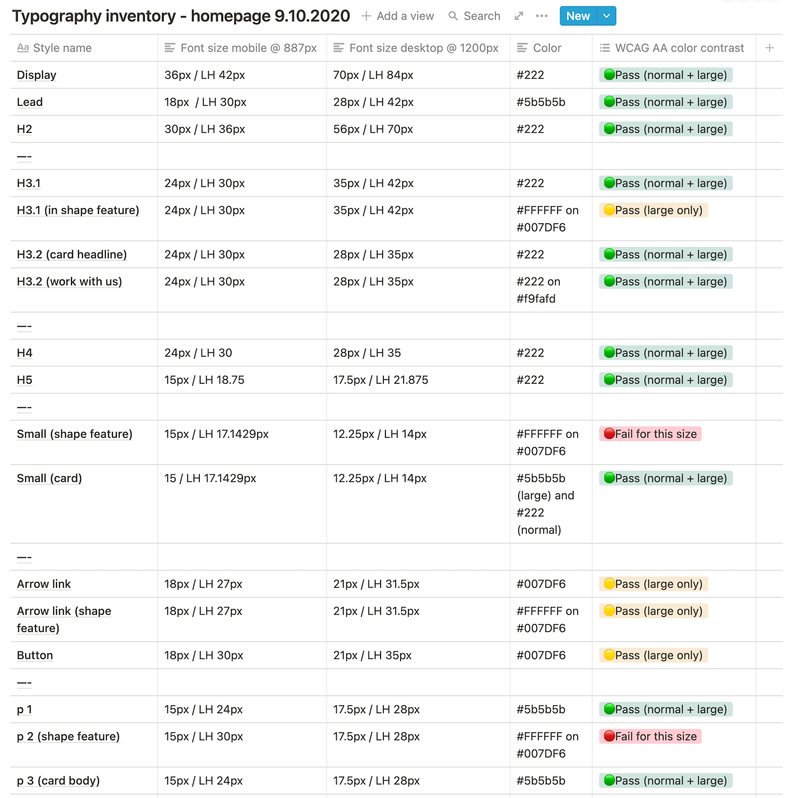
This is an example of a typography inventory. In this case, the inventory criteria that were relevant are:
- Font size
- Line height
- Color of text (when the color is not on a white background, that is noted)

Notice that font family and weight were not inventoried, as they were irrelevant for my goal at the time: to understand what font sizes existed in the live website so that I could start working with them when I designed new patterns. I gathered this information for both of our breakpoints (mobile and desktop). The first step in my audit was to determine whether the color contrast passes or fails the WCAG AA accessibility guidelines. I used WebAIM's Color Contrast Checker. From here I am able to make informed decisions regarding which font styles should be deprecated, and which ones should be used in any new component I create.
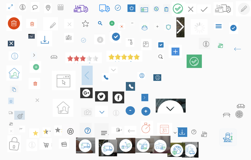
As another example, an icon inventory. We can see the plethora of styles and colors used. In this case, breaking them down further into detailed criteria was not necessary as it was clear that we would use an icon library to replace most of them. The inventory helped us make an assessment of what should stay or go and create guidelines for the future.

anchorStep 6: Create a game plan with your team
Once the inventory has been created and audited, it's time to meet relevant stakeholders and come up with a game plan to remove unintentional inconsistencies and improve the existing interface. The goal should be to transition into a pattern-based approach, and in the long run, an interface inventory can serve as a blueprint for the creation of a pattern library. Since it is a visual side-by-side comparison of the existing interface, it helps us communicate the status quo in a tangible way, and it's very effective when sharing it with stakeholders that are further removed from the digital product design and development process (ahem...people that decide on budgets and resources).
Interface inventories are small but meaningful when transitioning to a design system approach. Making one can help get the ball rolling in your team as they help us align and bring in momentum. And know this: even if you do the inventory and audit on your own, you are never alone. Consider joining the design systems community on Slack (it's a great place to ask questions or get feedback regarding this process), or hire a facilitator to help make this project a success.
